

Livin' by Mandiri app is a mobile banking application by Bank Mandiri.
Overview
Livin' by Mandiri is a mobile banking application from Bank Mandiri that increases the ease and convenience of customers in accessing its services.
The goal of this project is to redesign the error message in the app because it made confusion among users.
Role
UX Writer, UI Designer
Project Duration
2 weeks
Platform
Mobile - Android
Background
The Reason Why
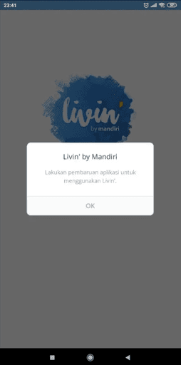
Image: Error message component screenshot
This error message component was chosen as a case study is because the copy on this component considered not quite effective to help users tackling the problem they encountered, which when users haven't update the app and they can't continue using the app.
define
Finding Problems & Defining Plans
Yes it was true, that solving a problem without validating the problem itself to real user, is not ideal and the results will be biased. But due to lack of time, I only able to talking back and forth to myself as a user.
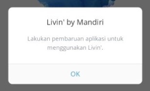
Image: Problems I try to solve
I asked myself, "as a user what I feel about this error message component?" And from that so-called conversation, I came up with 4 things bugging me.
Problem
The title doesn't explain the problem that users encountered
The copy used in the description is not clear enough
The button does not match the solution provided and leave users with no option but 1
Copy on the component above is also difficult to read because of the low contrast level
Action Plan
Rewrite the heading / title with another copy
Rewrite the description with another copy
Rewrite the button with more actionable words and add other option
Improve the color of the copy of better readability
recommendation
Tackling the Problems
Before I jump far into visual design, I took my time to validate the initial problem. By doing that, not only I have the assurance that my assumption is valid, but also I managed to gather further pain points from real users. Then I conduct a user research to dig deeper from users' perspective when ordering multiple foods/drinks with friends using GoFood.
Before
After
Point of Changes
Heading / title copy and color
Description copy and color
Button copy and other button option
Adding the hierarchy of the buttons
Rationale
Compared to the previous title that wrote the name of the application, the new title is more intended to inform the user what error occurred
The description uses the term update rather than update because it is more common. And also the application name is written in full.
The new button has a more actionable copy than just "OK" and does not guide the user to the solution. Also added the option "Later" in case the user does not have enough storage memory to update the application or is in a hurry so does not have time to update or is also saving data packages
The copy is changed to a darker color to increase contrast and make it easier to read. In addition, I also tested how well the choice of using the new color compared to the use of the old color through the WCAG 2.0 Standard using the Contrast plugin . The test will only focus on Normal Text (24px and below) because the font size on the screen ranges from 12-16px.

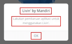
Image: Text contrast from the previous interface
Title received contrast scores “PASSED” AA (More Accessible) and “FAIL” AAA (Even More Accessible)
Description received contrast scores “FAIL” AA (More Accessible) and “FAIL” AAA (Even More Accessible)
Button received contrast scores “FAIL” AA (More Accessible) and “FAIL” AAA (Even More Accessible)
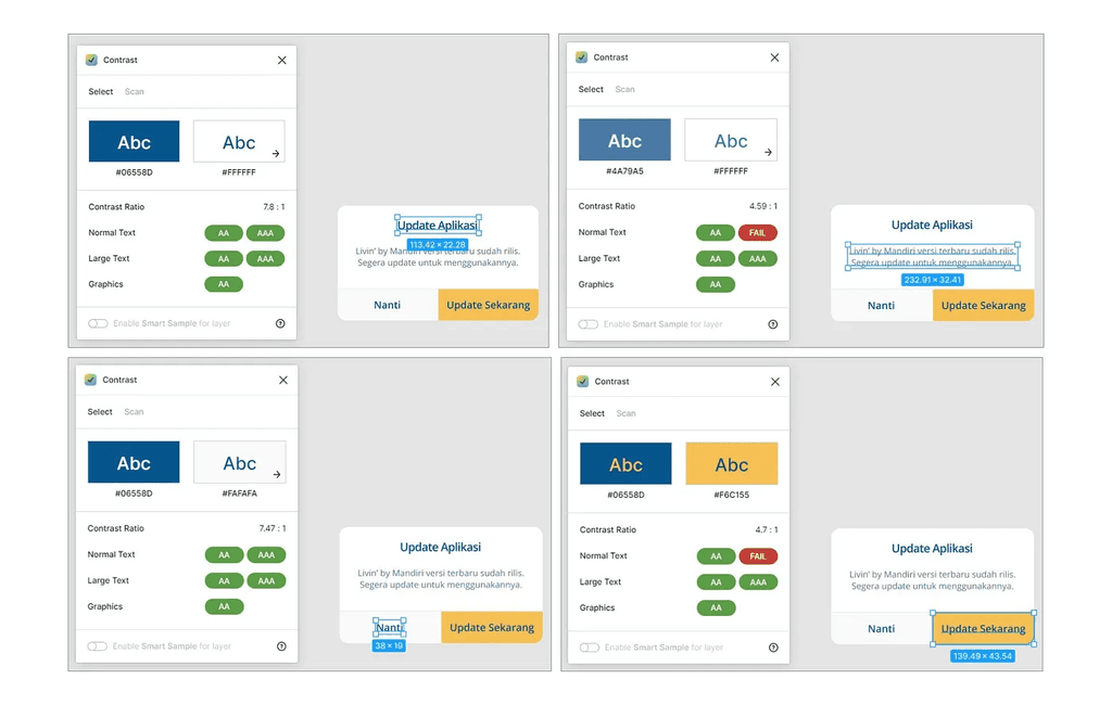
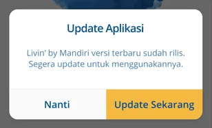
Image: Text contrast from the new interface
Title received contrast scores “PASSED” AA (More Accessible) and “PASSED” AAA (Even More Accessible)
Description received contrast scores “PASSED” AA (More Accessible) and “FAIL” AAA (Even More Accessible)
Button “Nanti” received contrast scores “PASSED” AA (More Accessible) and “PASSED” AAA (Even More Accessible)
Button “Update Sekarang” received contrast scores “PASSED” AA (More Accessible) and “FAIL” AAA (Even More Accessible)
So it can be concluded that the new screen has higher contrast and more accessible than the previous screen.
test
Validating Solutions with A/B Testing
To validate my solutions made some good impact to the component or not, I conduct an A/B Test. Why A/B Test? Simply because of the time limitation and simplicity of the test on how to conduct it. And A/B Testing test results are enough to validate the solutions.
Conducting the Test
In this case study, I asked for help from 5 participants who were the users of Livin' by Mandiri application. I show them both error message component of the Livin' by Mandiri application and asked them to choose which interface worked and looked better for the purpose of showing error message and helping them to solve this 'error' issue.

Image: The A/B test
There are 3 parameters to validate the solution. And from the five participants, there are several answers along with the reasons they put forward:
Readability
From screen A & B, which screen you find easy to read?
Participant 1: B, “clearer and eye-catching because the button is colorful , unlike screen A which looks blurry”
Participant 2: B, “copy is clearer to read because of its color, while A is like blurry because it is gray”
Participant 3: B, “it's easier and you know what to do”
Participant 4: B, “ the color is more contrasting so it is more tempting to read screen B, while A is dim”
Participant 5: B, “the determination of color on screen B makes it clearer to read compared to screen A which is only gray”
Comprehension
From screen A & B, choose 1 screen that you understand more what you should do?
Participant 1: B, “because the title clearly directs where to go plus a button that matches the destination that has been directed”
Participant 2: B, “I understand better that there is a new version and we are asked to update, the information in A is not very interesting when read”
Participant 3: A, “it's simpler, I'm told to update”
Participant 4: B, “because the language is more familiar and there is a message to update immediately”
Participant 5: B, “I understand better, because I was told from the title Update Application compared to Livin' by Mandiri”
Engagement / Conversion
From screen A & B, which screen more likely you makes update the app?
Participant 1: B, “more colorful, clearer commands and objectives so as not to lead to the wrong choice”
Participant 2: B, “there is freedom to choose between Later and Update Now, the language feels more polite so that it is more likely to click on B”
Participant 3: B, “clearer commands directing to update”
Participant 4: B, “no need to bother opening the App Store first, it is directed directly to update, so there is no need to search again, especially if you are in a hurry”
Participant 5: B, “because if screen A, OK, I don't understand what the objective is and where it is directed is not clear, if B, the objective is clearly to Update/Update later”
So, with the test results above, it can be concluded that the solution offered is successful, because it can answer the problems above.
Closing
Conclusion
I think when I work on this case study, I learn that color is playing a very important role on UI Design. Choosing the right color can give impact to business future. Also what I learn the most is the importance of research can strengthen the foundation of my case study. Thank you!